Dr. Reddy’s Laboratories — Building the future of healthcare engagement with Lean User Experience
While working at QED42 I got chance to work for Dr. Reddy’s Laboratories to create a diverse digital engagement portal ,Our primary goal was to foster a stronger connection with healthcare professionals (HCPs). We accomplished this through granting HCPs access to tailor-made, valuable medical content. This platform is not only multilingual but also universally accessible, ensuring HCPs worldwide can conveniently access it in their preferred language.
TEAM & ROLE
As the UIUX designer for this project, I closely collaborated with the Sr. UIUX designer to create a streamlined experience. My role involved hands-on participation in all aspects of the design process from Research to designing hi fidelity designs, ensuring a cohesive and intuitive user experience
WHAT I DID
I worked on desk research, from designing workshops to preparing stakeholder’s questionnaire and discussing insights. I worked on ideation of component explorations in terms of UI & UX. and on how can we minimise discord by empowering users so that by leveraging existing mental models,
WHAT I DELIVERED
I delivered insightful desk research and a set of components for astonishing design system also I played a major role in thinking how can we minimise discord by empowering user by leveraging existing mental models so that users can focus on their tasks rather than on learning new models.
RESULT
Through this engagement, HCPs at Dr. Reddy gained a unified platform that offers them convenient access to medical information in their preferred formats. The centralized hub streamlines management for the content authors and significantly impacts efficiency.
THE BACKGROUND
The challenges
In addressing Dr. Reddy Laboratories' HCPs' challenges, we had to design a user-friendly and intuitive platform, accommodating users with limited technical expertise. It was crucial to make this platform multilingual to cater to the diverse healthcare professionals worldwide, we also had to ensure robust security measures to safeguard sensitive medical data.
Users and Audience
This platform caters the diverse healthcare professionals worldwide. These professionals include doctors, nurses, pharmacists, researchers, and other specialists involved in different aspects of healthcare delivery and management
DESIGN PROCESS
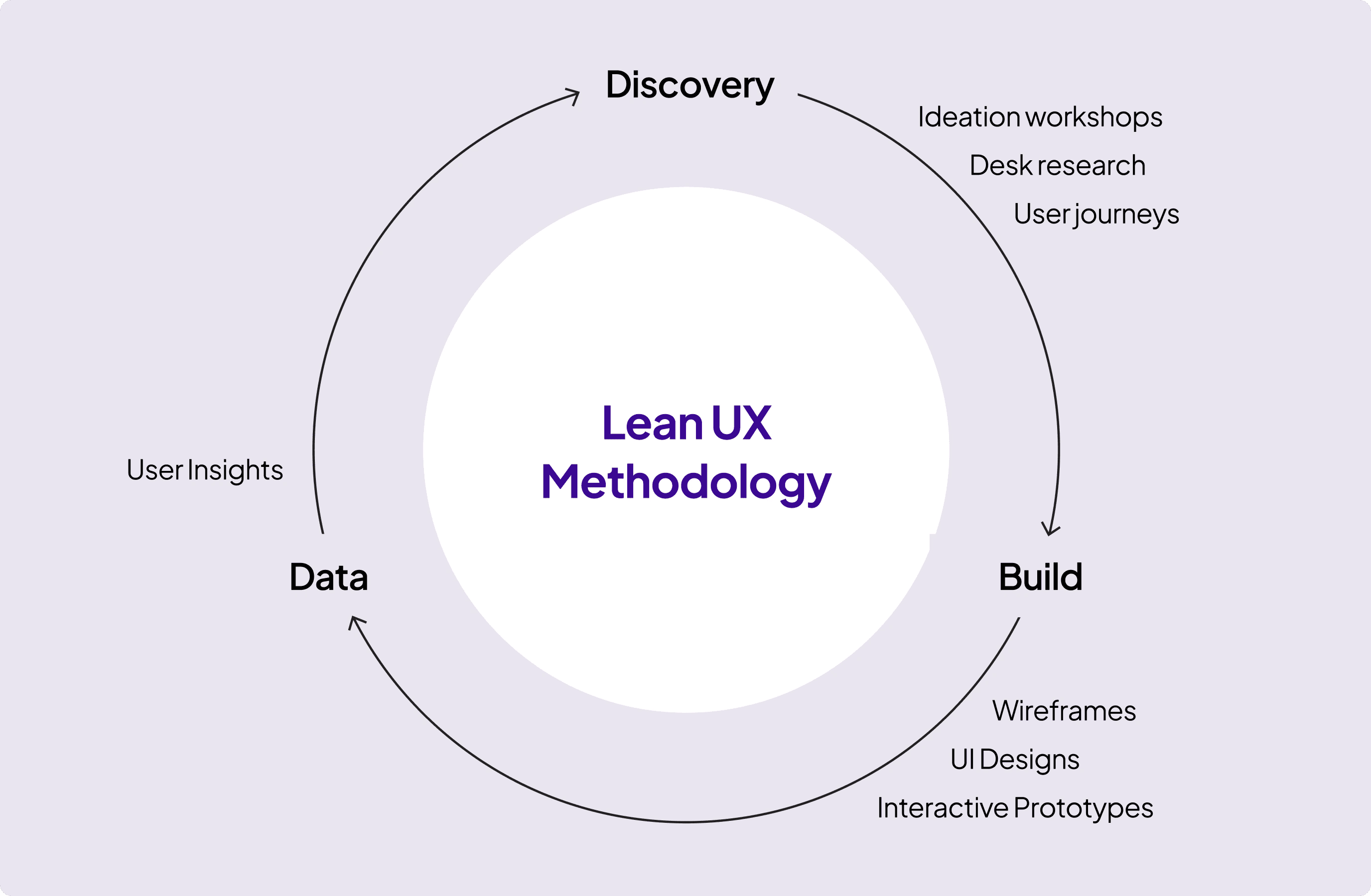
We implemented a lean UX methodology to foster close collaboration with the DRL team at every stage of the project.
This approach applied rapid iteration and continuous feedback through discovery workshops, mapping out user journeys, developing wireframes, crafting intuitive UI designs, creating interactive prototypes, and ensuring that every decision was informed by real user insights.
Research
Research
The workshop with the stakeholders helped us understand how doctors and pharmacists would use the platform and enabled us to understand user pain points, needs, and motivations better. We then mapped out their journeys, illustrating how each persona would engage with the platform's features in various scenarios.
Research
Problems
User perception regarding brand focussed content
The industry at large is quite focused on brand and business, hence anything coming from pharmaceutical companies is viewed with a pinch of salt. Users feel the content delivered to them is biased and lacks freshness. HCPs believe most of the content provided according to industry standards, is brand specific and caters to their preferred therapy areas of interest only.
Lack of access to credible and authentic content
HCPs looking to get access to credible information related to patient care and updates related to the medical world will not have it easily available to them in an easy-to-consume format ensuring a high level of authenticity.
Varied needs and interests of the HCPs
Hectic work schedules mean HCPs are always on the lookout for credible, authentic up-to-date information that is available in a shortened and crisp format. Information that is easy to access and navigate without the hassle of excess screen spaces. As specialised doctors are the audience, the content will be niche and thought leadership based. The content is made available in the form of listicles, videos, white papers, case studies, webinars, and expert talks. The HCPs who are not very tech-savvy will also be able to easily read content on the go in mobile format. The platform will enable customers to connect, engage and participate in conversations if interested.

IDEAtion
Solutions
Based on the problems at hand, we developed personas and divided them into primary and secondary users. This enabled us to specify the number of user journeys. We went back to the root of all these problems and accordingly adjusted the user journey mapping touch point to create frictionless journeys. Based on the user journeys and key challenges that we were looking to resolve, we built an information architecture, user flow, and feature concepts for the DRL platform.
Once we’d worked on the user flow features, we looked to assess how easy or difficult it was to access the content available. We looked into different touch points along the user journey using task flows and low-fidelity wireframes.
After the user task flow analysis, we figured that there was still adequate room for improvement in the touch points of the user journeys. So, we optimised this journey by housing the platforms with text-rich and video-only content (separately) while also making them accessible with just an easy switch. This ensured users were able to pursue and focus on their chosen content preferences through an enhanced user journey.
We designed the remaining screens in the user flow via continuous feedback in an iterative process. We took approval from the stakeholders at each stage of the design process during revisions of the user journeys and user flows.
Design
Detailed Solution
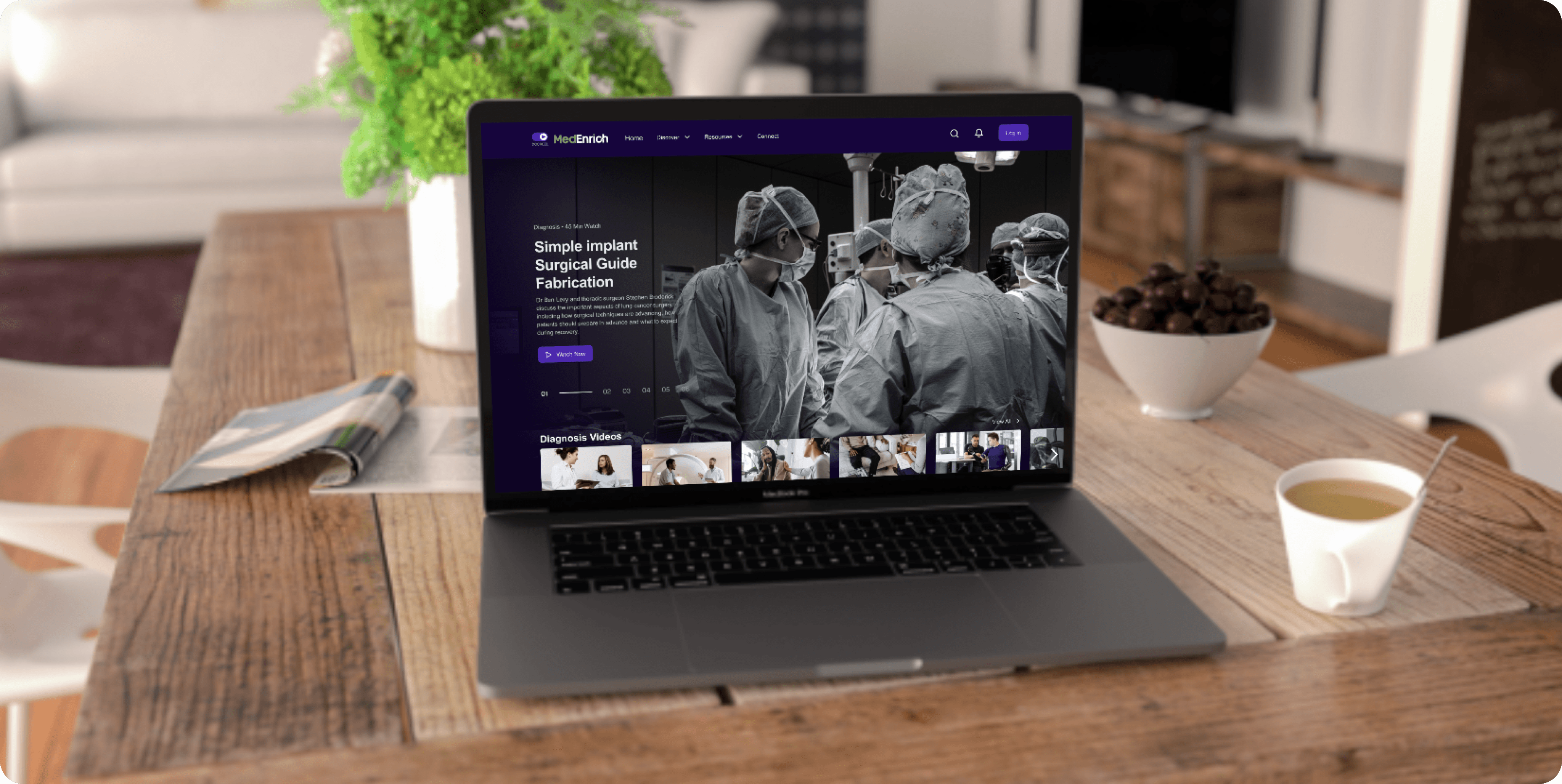
To facilitate meaningful connections among healthcare professionals, we initiated a process by first developing preliminary iterations of wireframes. These wireframes were tailored to seamlessly transition users between two core platform experiences: one centered around text-based interactions and the other exclusively focused on video interactions.
Personalised content
We enabled users to personalise the content they wished to see as per their preference. We took into consideration; preferred interests based on specialties, content type, and amount of time they could spend daily. These parameters helped us to show all the relevant content to the HCPs and to also overcome the notion of ‘brand focussed content’ and also aided in user retention.
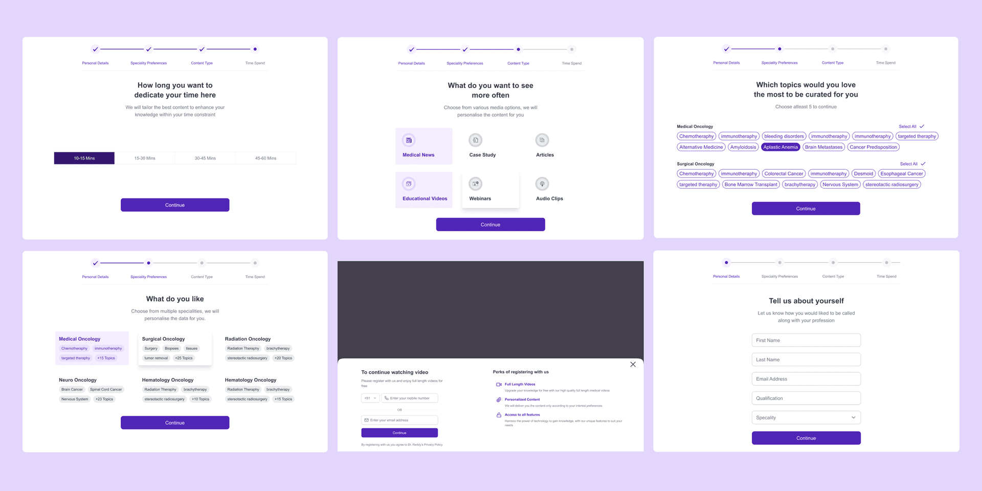
We also categorised the content to users based on the purpose of the content, i.e. - diagnosis, treatment, and prevention. This categorisation has helped ease the hassle for users to find the specific content they’re looking for. Along with the purpose categorisation, we have also added another section that’s based on content popularity and the latest content additions on the platform. This helps users keep up with the latest information that’s trending and suitable to their needs.

Users can now follow their favorite authors and key opinion leaders from different specialisations in the medical field. Following authors allows the user to see content specific to that author along with other personalised content based on user interests.

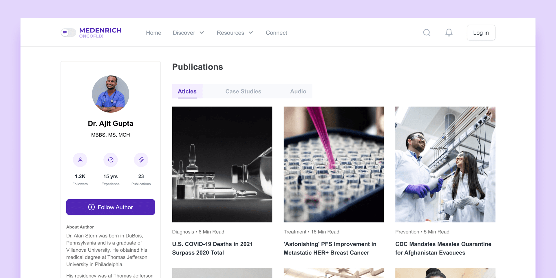
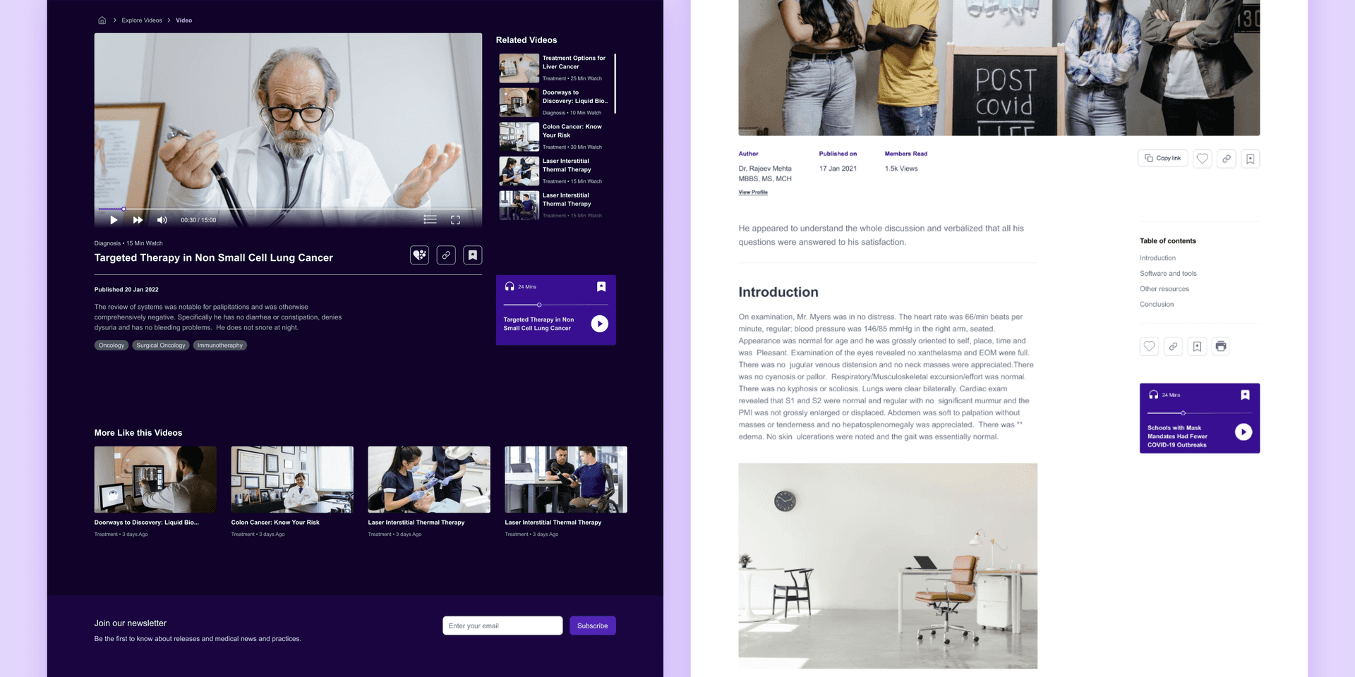
Detailed author profiling for content generation
Despite multiple websites and platforms offering medical content, HCPs often struggled with the credibility of the content they viewed. We decided to come up with ideas that would help establish the legitimacy of the content as we noticed how this was posing to be a challenge to the users. So, we created author profiling. This allowed users to know everything about the author’s background and experience. It provided users with assistance to determine the credibility of the content based on what was available to the author.
Wide variety of content types with switch experience
Having a large variety of content, covering a variety of interests, practices, and go-to material on the platform makes it easier for the HCPs to refer to and gain access to. Once we had a good idea of the different user personas, we figured that there were quite a few overlapping content kinds that each persona needed. So, we ensured that the platform was able to accommodate a vast variety of categories in different formats for every persona.
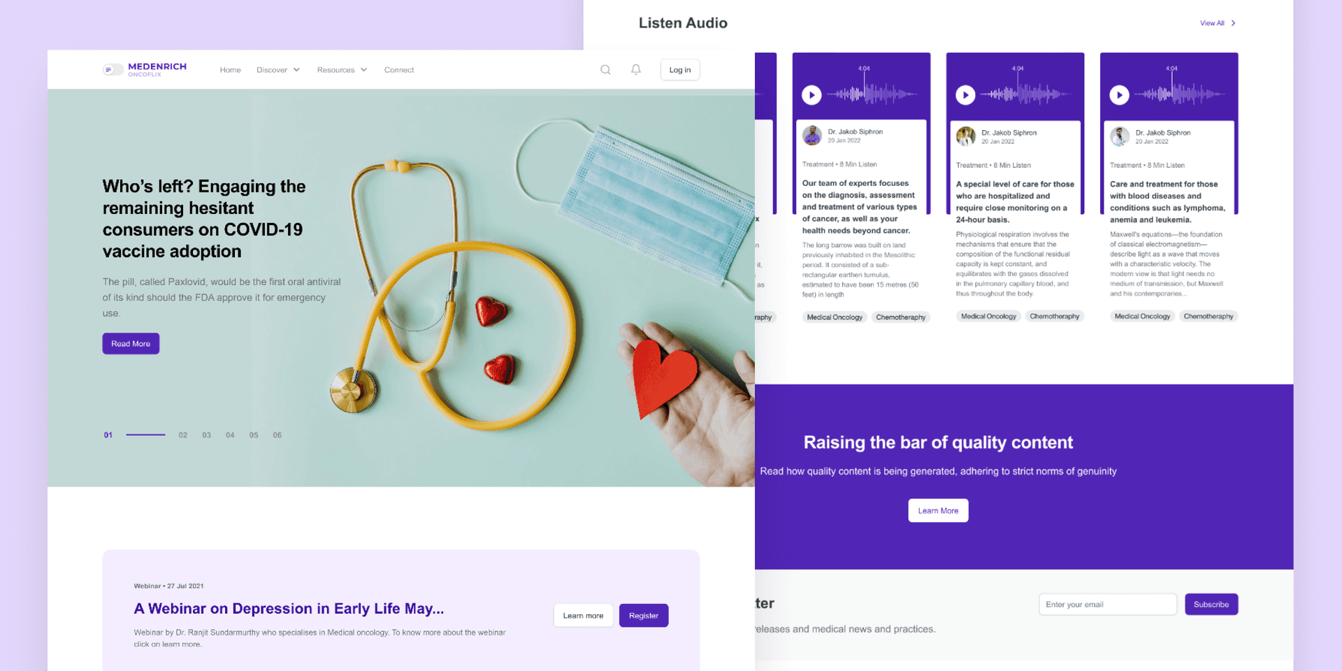
During the conceptualising stage, we came up with a concept that could accommodate all text-heavy content independently. This was designed to provide support to users who wanted a clutter-free experience. So, instead of having all the content categories in a single platform, we grouped similar content types. The primary reason behind this was to avoid the navigation of complex IAs and user frustration due to the cluttering of overwhelming information in a single space. So, we grouped the similar content types for each platform using a simple global switch in the header wherein the user could easily switch between reading and watching experiences.


Mobile-first approach
During the discovery phase, we found that a majority of our users would be extremely busy due to hectic daily schedules which is why they would want to consume content on the go. So, we decided to make each screen mobile responsive instead of the standard web design strategy. This ensured every screen was built using a mobile-first approach. Using this method also helped us make all the features usable on screens irrespective of size and ensured that we didn’t have to sacrifice functions for any features’ intended use.

Content for consumption in different formats
We realised that users don’t always wish to watch nor have the time to watch a complete video but would rather know the key points being discussed in the video. We added video chaptering to enable users to skip to specific points they were interested to watch and skim through the videos at will.

We also found out (during the discovery phase) that a majority of the users were quite accustomed to listening to podcasts or audio-based articles. We decided to provide users with the freedom to consume information in any specific format they wished. For this, we created a feature that would allow the users to listen to the audio only instead of watching videos or reading articles and consume information accordingly.
Measured and improved engagements
One of the primary focuses of the platform was to enable the country marketing teams at DRL full control of the platforms to be able to promote relevant content and provide insightful stats. We incorporated the ‘like’, ‘share’, and ‘bookmark’ features into the MVP versions of the platform after weighing in the different engagement features and also keeping in mind the different project timelines. We opted against adding ‘comments’ for the MVP version due to technical challenges and the lack of comments governing structure at DRL.
During user research from our initial discovery phase, we noticed that one of the user goals was to search for and obtain concise and relevant information that could be consumed quickly and also saved for later. The ‘save for later’ feature enabled users to not just bookmark pages for later but also directly improved content engagement by raising the proportion of quality engagement (time spent) and repeat visits; the two KPIs for measuring engagement.

synopsis
Design validations
Right from the wireframing stage till we had a list of concrete designs, we worked on iterating the concepts. To assess the user flows and accessibility of different scenarios, we prototype the wireframes and designs. This enabled us to iterate all our designs over time and ensure we were on the right track.
We were also able to assess the viability of each design and iterate them in response to the potential solutions and recommended feedback through weekly cadence with the developer team and other stakeholders of the project.
REFLECTION
Impact & Reflection
The delivered platform provided HCPs with a unified, multilingual hub for accessing medical information in preferred formats. This centralized solution streamlined content management for authors and significantly improved efficiency. Additionally, reflection on the design process highlighted the importance of aligning UX solutions with business goals and selecting practical solutions that cater to the majority of users.